I am thrilled with how this house turned out... It's exactly how I saw it in my mind. Love when that happens.
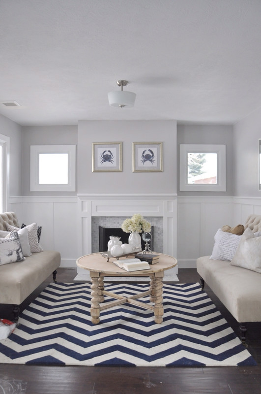
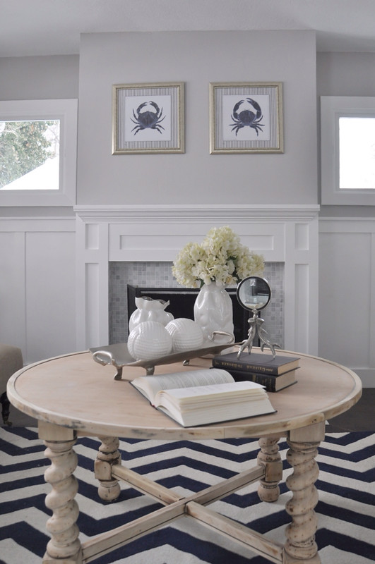
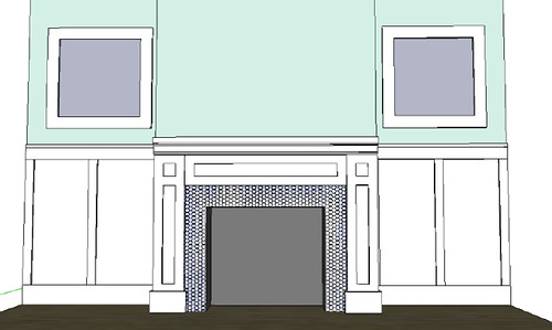
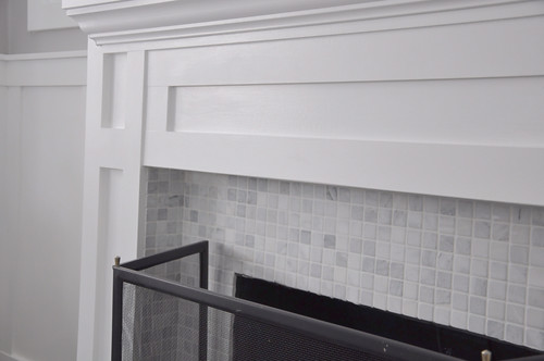
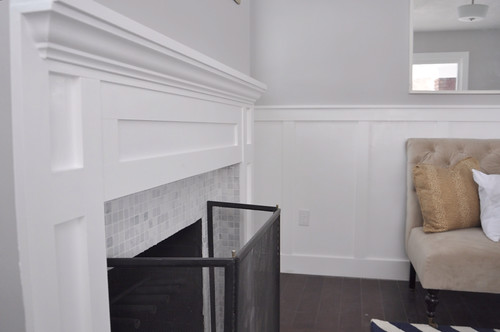
This house was beat... I am going to try and find the before YouTube video tour... Makes the transformation that much better... I am crazy about these rounded 1x1 marble tile squares on the fireplace...
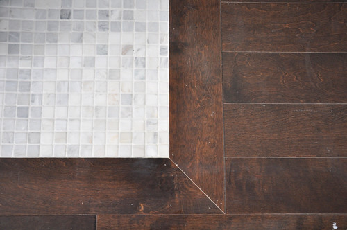
The hearth... I love how the dark brown floors brought out the touch of brown in the tile...
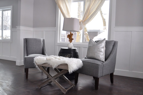
Don't mind the wonky curtains... There was some touch up paint drying... Or it's a new look...hmmm....?
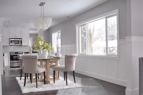
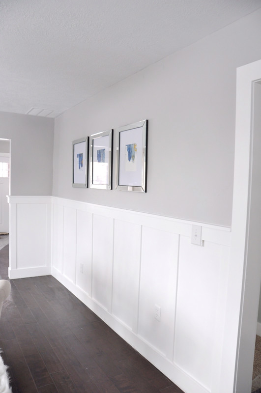
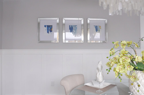
I went with Benjamin Moore Stonington for the gray on the wall...
Such a rich gray...
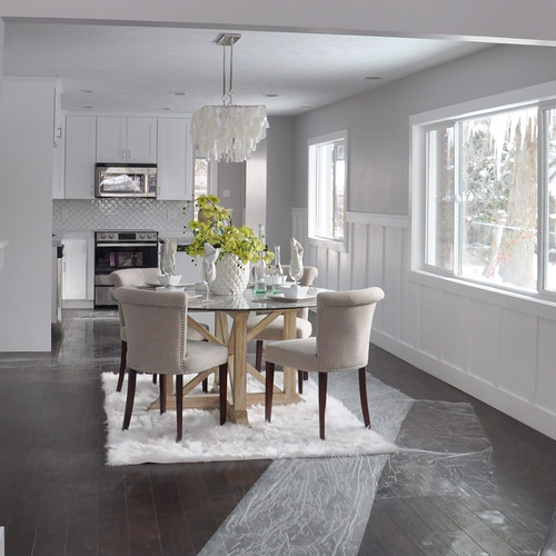
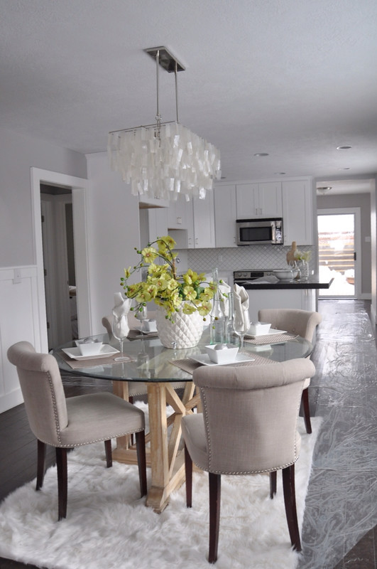
Crazy about this West Elm Capiz chandelier...
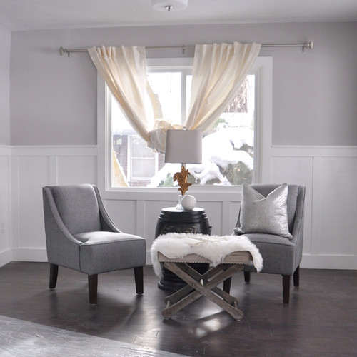
I think this wainscot adds so much charm to the house...
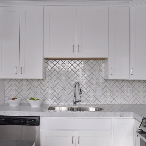
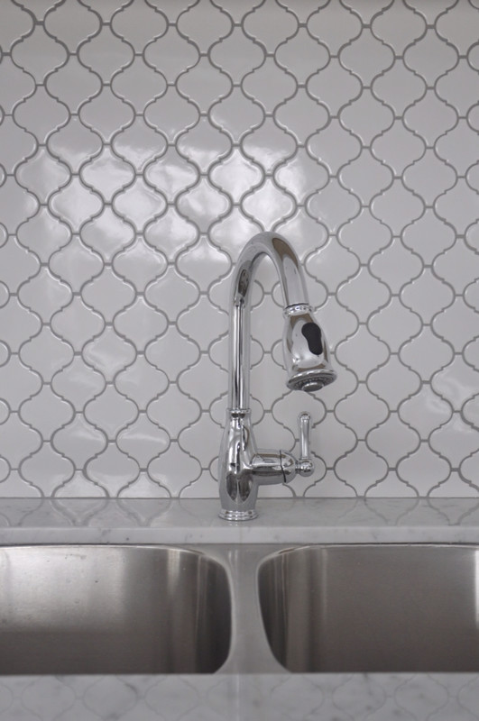
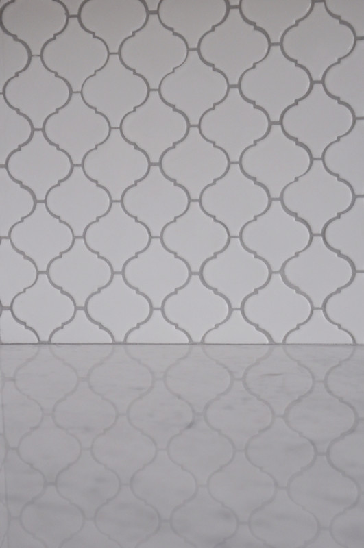
I snagged this quatrefoil tile off of overstock.com during a sale and got it 60% off... Can't beat that....
Love the plain white with the Carrera...
Can you have too much trim? I've yet to see that happen!
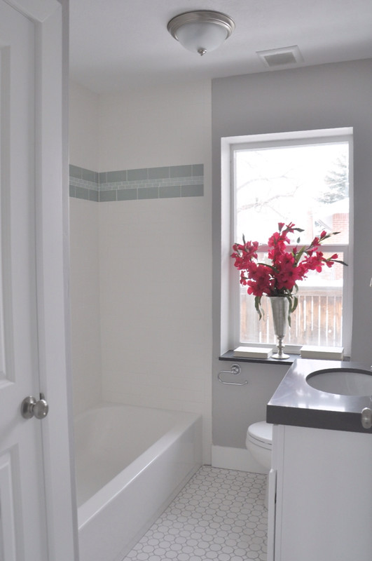
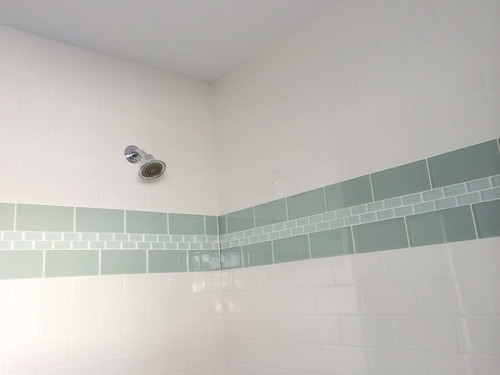
This is the upstairs guest bath... I am nuts about this blue/green tile... I tried a new pattern with the larger subway sandwiching the smaller subway, I love it,
The master turned out amazing... I was ready to move right in and never leave!
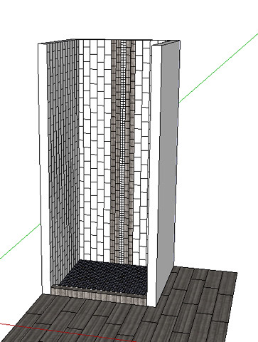
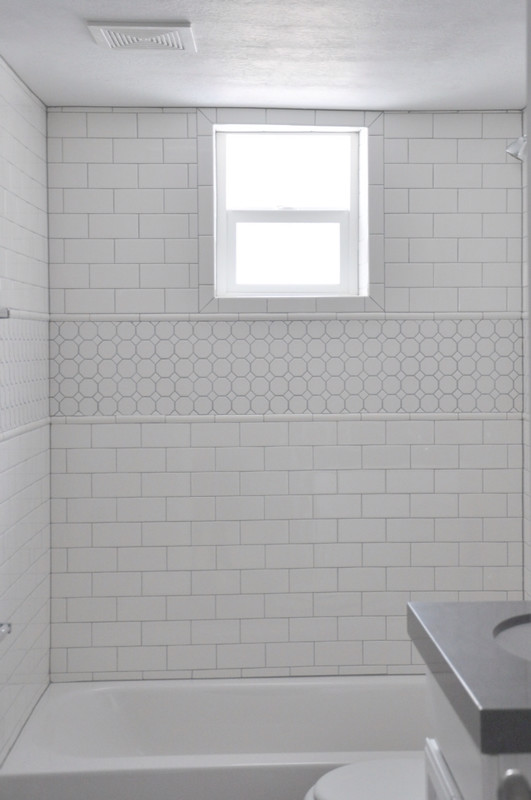
I switched things up and went with vertical tile for the shower... So,etimes I think vertical shower feels too modern, but it just loved how the white shell tile looked like a trickle of water...
Love the window trim tile...
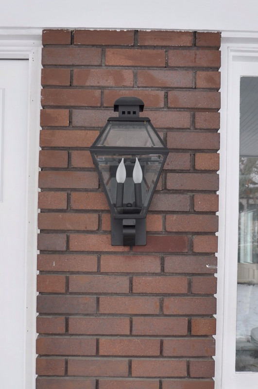
I went with two oversized lanterns for the exterior... They are epic!
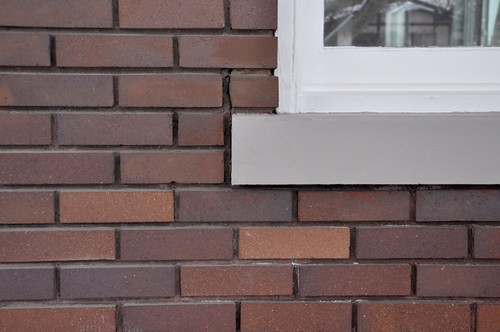
The foundation and wind aprons were all painted fire engine red. I used this gray because of the hint of blue it had in it, so it would pull the blue out of the rather than the orange... It worked!




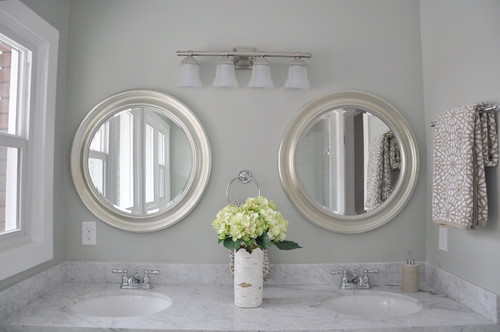
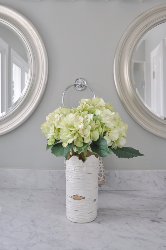

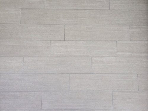


Amazing place. Great job and love how clean and simple everything is. Def move in ready.
ReplyDeleteI'd love to hear what you do about windows in shower stalls - is there anything you do in particular to make sure the sill is waterproof? How do you make sure the light still streams in, but allows for privacy?
ReplyDeleteWhat a gorgeous house. I wish I could have you come fix my house up.
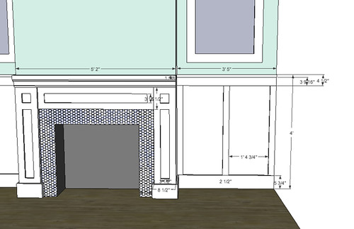
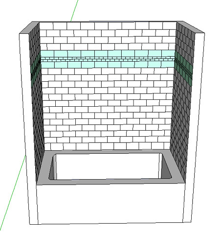
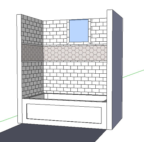
ReplyDeleteWhat program do you use to render your shower surrounds? I would love to do that vs. hand rendering!
ReplyDeleteHi! I use google sketchup. I had no previous experience with any other drafting program and just went to the google sketchup page and watched their tutorials! It's awesome. I wish I was better at hand rendering! I think some of those images can be so beautiful! Good luck!
Delete