We are nearing the finish line.... Last week we finished the tile room.... Or bathroom.... There is SOOOOOOO much tile! If you follow me on instagram, you have seen more of the day to day process of tile.... I love that little visual journal!
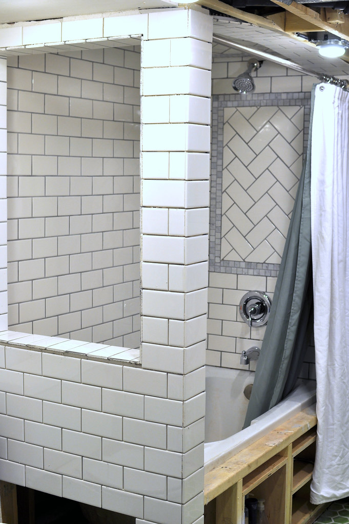
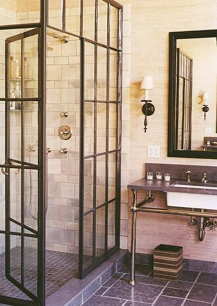
The first detail I want to point out is the "window" opening on the end of the shower. I designed this for several reasons, the first is, we have so much detailed tile in the bathroom, I want to have multiple angles to view it. Our bathroom is small and having a window opens up the view when you first walk in. It also allows light to enter the shower which would always be dimly lit otherwise. And lastly I fell in love with the photo below of the industrial style shower stall, so by adding this window feature it will allow me a space to put in a paned window in our bathroom... Function and style.
(remodelista.com)
Imagine those panes in that space.... Perfect!
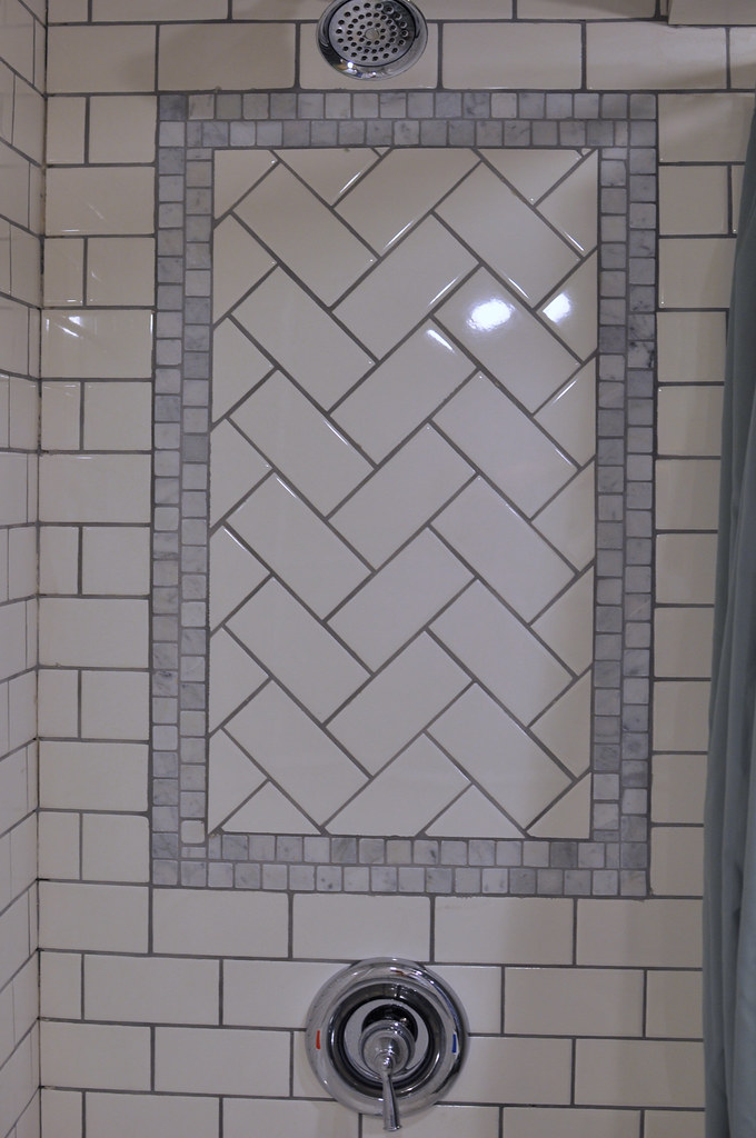
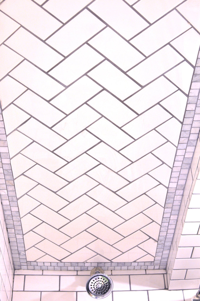
This herringbone was a major headache! But it was worth it! Then we designed the mosaic marble tile to accent the herringbone tile, but I wanted each layer of the marble mosaic tile offset to add a little more aesthetic dimension to the design.
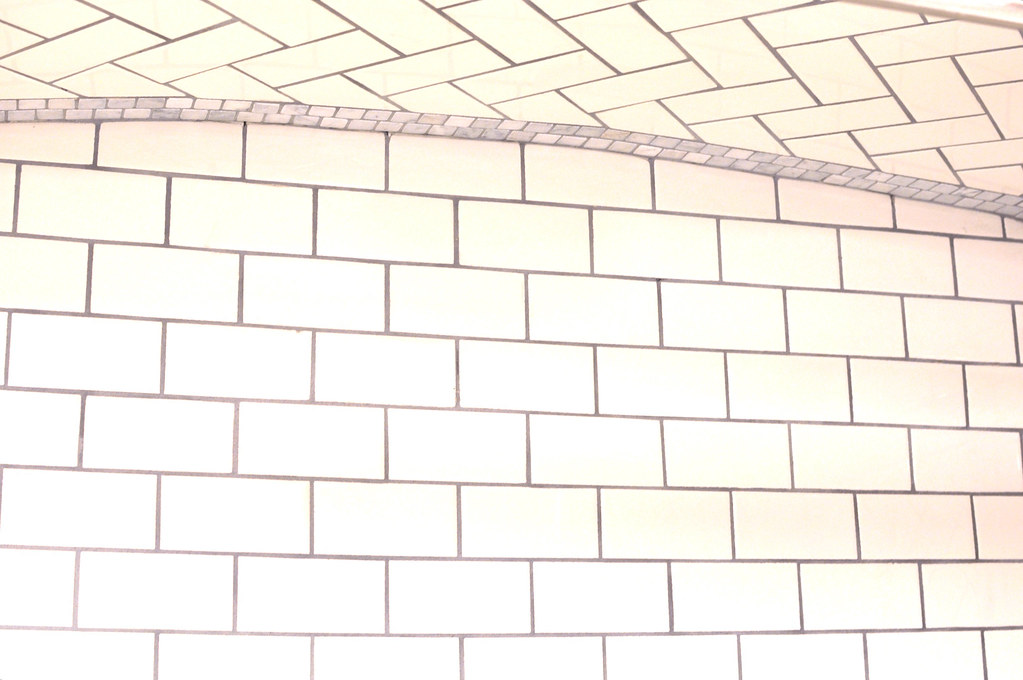
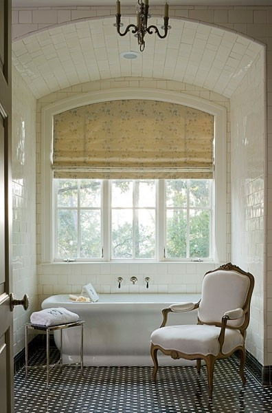
The ceiling.... Oh the ceiling... I love it... The bathroom because we are in the basement has some plumbing from the upstairs that causes the ceilings to be lower in some spots... However we placed the tub where there were no pipes or vents, so we were able to make the ceiling higher when we stepped into the tub. To add a little extra pizazz we arched the ceiling.... And then to pizazz the pizazz we herringboned the arch. Tile PALOOZA!
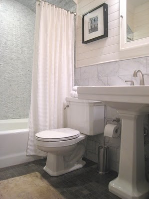
After I have a design in my mind, I start research to see if others have been able to create the look I want. The photo below had the arched ceiling I wanted and my marble tile wainscot... This gave me the reassurance to go for it...
(newlyweddiaries.com)
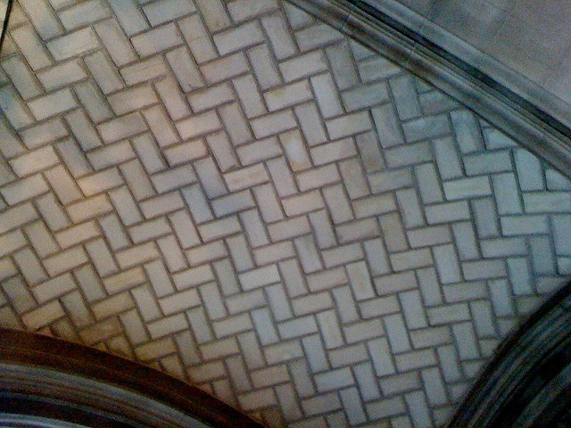
Below is something I stumbled upon while studying tile design. I fell in love with the curved herringbone. This is one of those inspiration pictures, that is fun to look back on when you realize you recreated it.
(pink-to-green.blogspot.com
Another curved ceiling... What I really liked about this tile is how they staggered the square tile with the rectangle to give it a shingled look... People are so creative.
(simplyseleta.com)
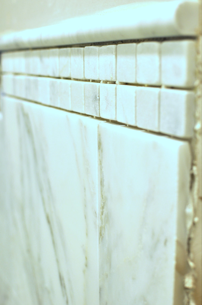
We have our marble wainscot trimmed out with two layers of mosaic tile, topped off by a bullnose rounded tile to give it a nice finished line.
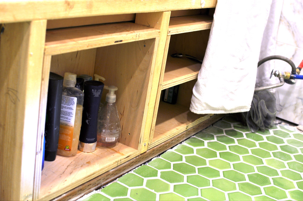
And our tub storage... It is my belief that we don't need massive houses, we just need to use our space better. I would rather have a small home, done well to the last detail.... Then an oversized home, mass produced with cheap finish work. By adding storage in commonly wasted space, we are able to live more comfortably in a small space, and be able to afford marble wainscot!
The tub below has square panels on the side, this Is what the doors will look like that cover our tub storage.
(houseofturquoise.com)
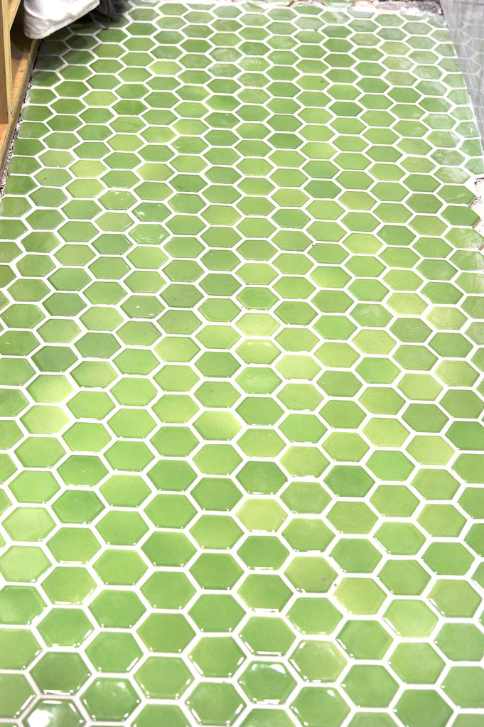
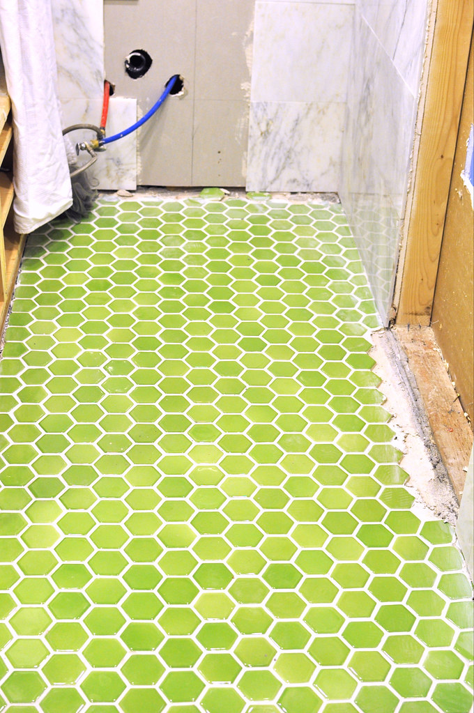
And our green tile...... I love, love, love it! But oh boy, laying each tile on by one, was quite a job... And can you see how amazing Drew is.... Those grout lines are near perfect.... Okay, let's just call them perfect... (Need a tile guy? Hhmm? You know who to call... 801.244.8790) I love the mix of shades in this tile.
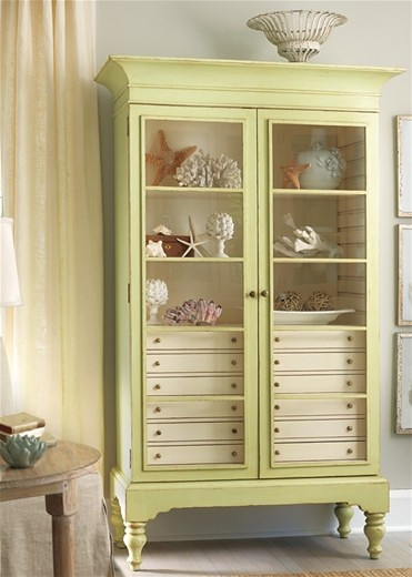
In the picture above you can see on the right a space cut out of the wall, that is where Drew is building a hutch like the one below that will sit inside the framed two by fours. By setting it in the wall, and having a little built out we are able to get 8" of storage space, while only taking up four inches of room space...
(laylagrace.com)
And isn't it lovely?!
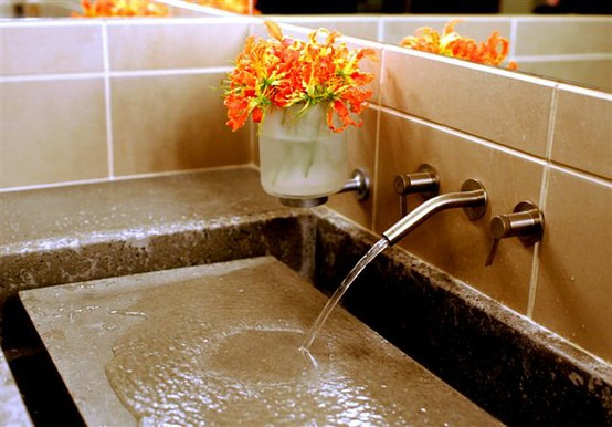
And this is the sink we are going to make, form it out of melamine, and poor it out of concrete.... I really like this design, first because it's different, I have never seen it anywhere, and second because when the water is off it adds more table space while getting ready. And that is our tile room....



Uh, WOW. I want to come have an in person tour sometime. I love that you are making the most of your space by built in storage. Seriously, that is what I need. Anyways, it is looking great. I haven't seen you for a long time now that I have been banished from YW. P.S. Why are you up posting things at 4 in the morning?
ReplyDeleteLindsey it has been forever!! When it's all finished we'd love to have you guys over. I miss Ethans cute face! And I post at 4 am to be prepared for you who reads at 6 am! Ha!
ReplyDeleteyour bathroom is looking so so beautiful. You guys are pretty amazing. I love all your creative remodels, super fun kid projects (a-frame and lanterns!!!), and your pooches. keep blogging. xoxo
ReplyDelete