We are thrilled beyond thrilled to be featured on designsponge.com today.... I can check that one off my bucket list! Seriously so amazing... I thought I would do a quick recap for any new comers to tell you what we are all about!
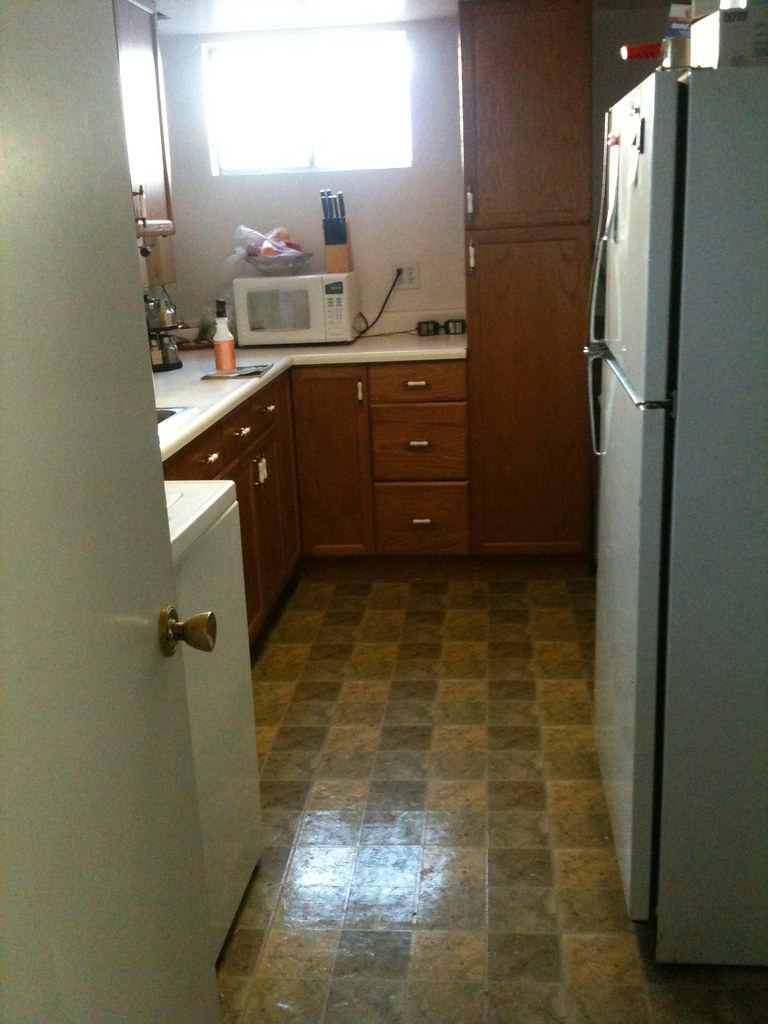
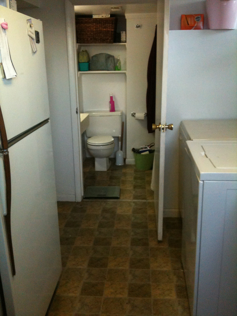
We are living in a basement apartment while we rent out the upstairs... We are fixing it up in between jobs... Here is a look of the kitchen before... Not fun! The best part is this picture is taken while standing in the bathroom... A little too close for comfort!
The kitchen was tiny, huge fridge and stove, washer and dryer were in there as well... Along with about a foot of the bathtub jetted into the room, creating and awkward jut into the kitchen. Little storage, little countertop space... With a lot of wasted space behind the stove and fridge...
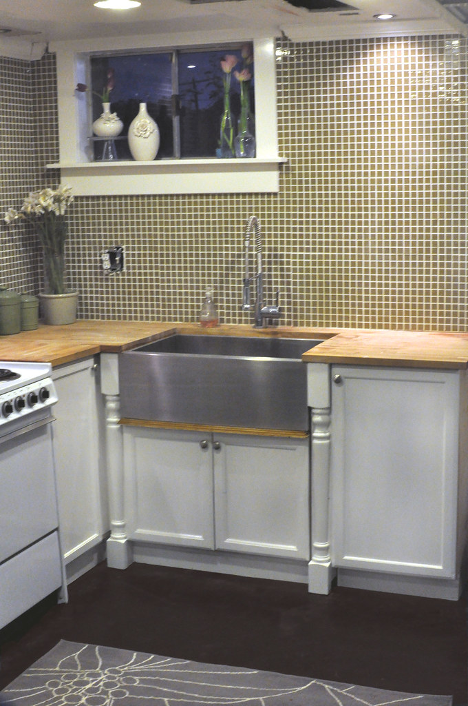
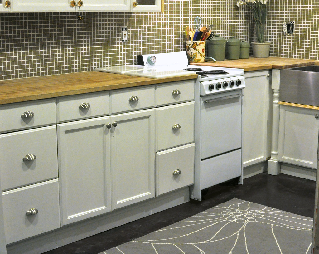
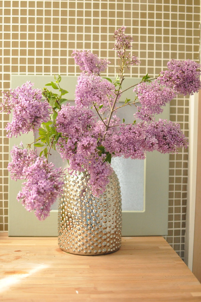
We gutted the whole place, and did countertop to ceiling glass mosaic tile back splash. With tile we found at Home Depot on sale for $2.00 a square foot. Bought a farm sink from online classifieds, repainted the existing cabinets, and built a few more... Trimmed out the window and voila! New kitchen!
We bought the tiny stove from classifieds, and the smaller fridge from a second hand appliance store, and got the butcher block countertops from ikea.
And now everything about it makes me happy!
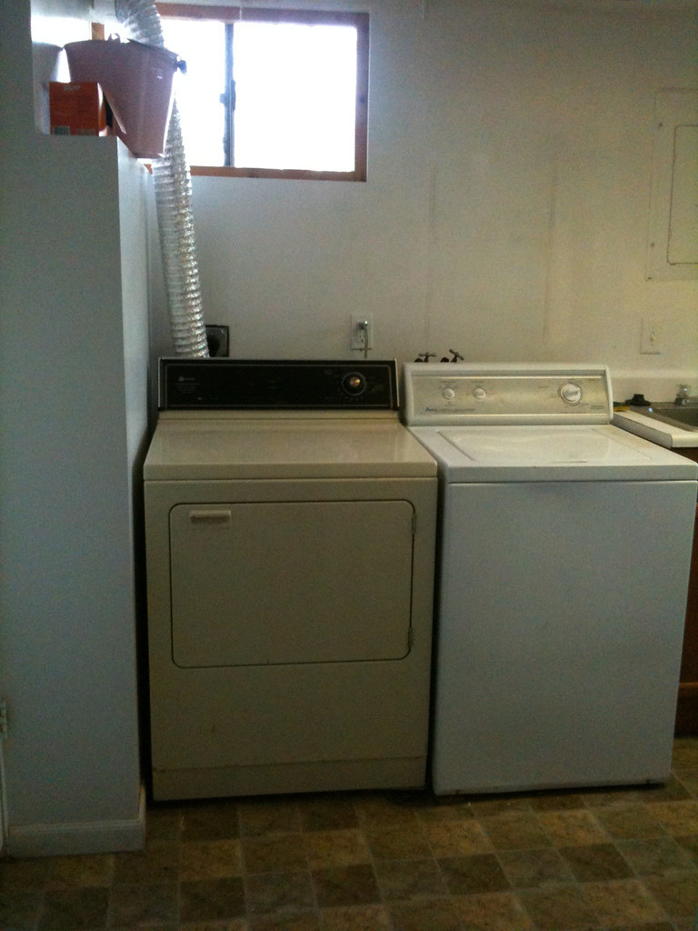
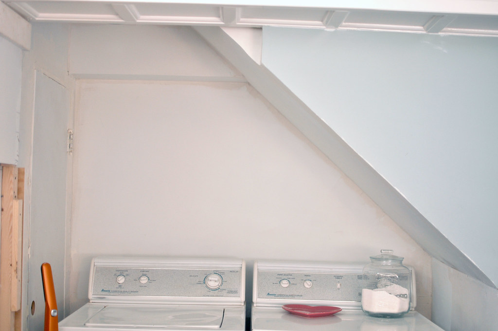
The awful washer and dryer got replaced with some trade work Drew did... And the were moved to the wasted space under the stairs. Previously blocked by giant fridge and stove...
Still a work in progress!
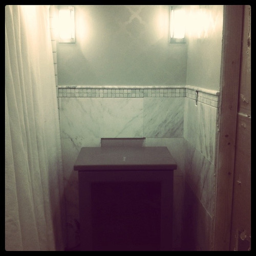
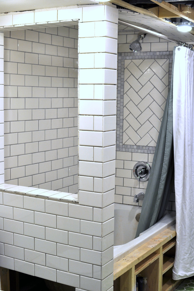
In the kitchen staring into the bathroom... Not awesome... We closed off that door, and completely re arranged the bathroom... By taking a closet from another bedroom, we now have so much more room... Win win!
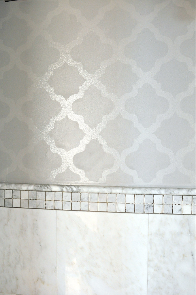
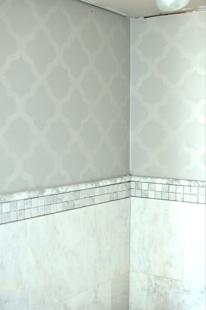
We went tile crazy and stenciled the walls!
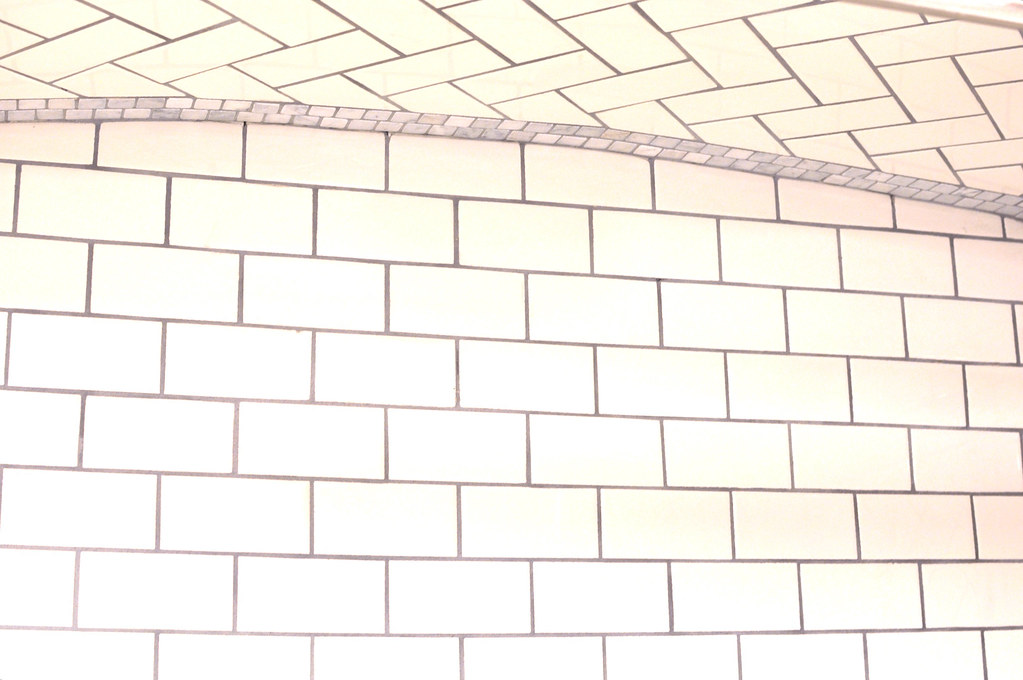
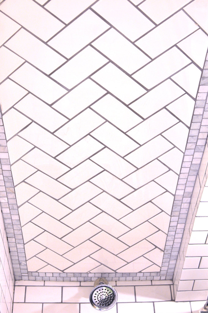
We did a curved ceiling in the bath, with herringbone accents...
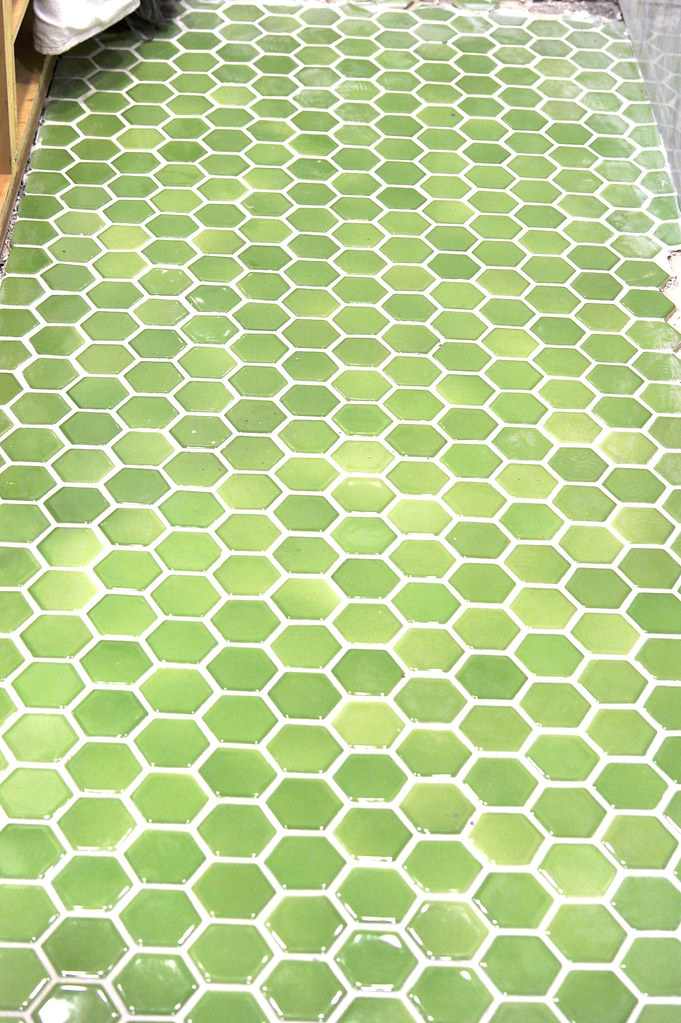
We found this green tile in classifieds, for $60, it adds so much spunk to the room.
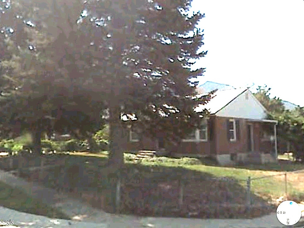
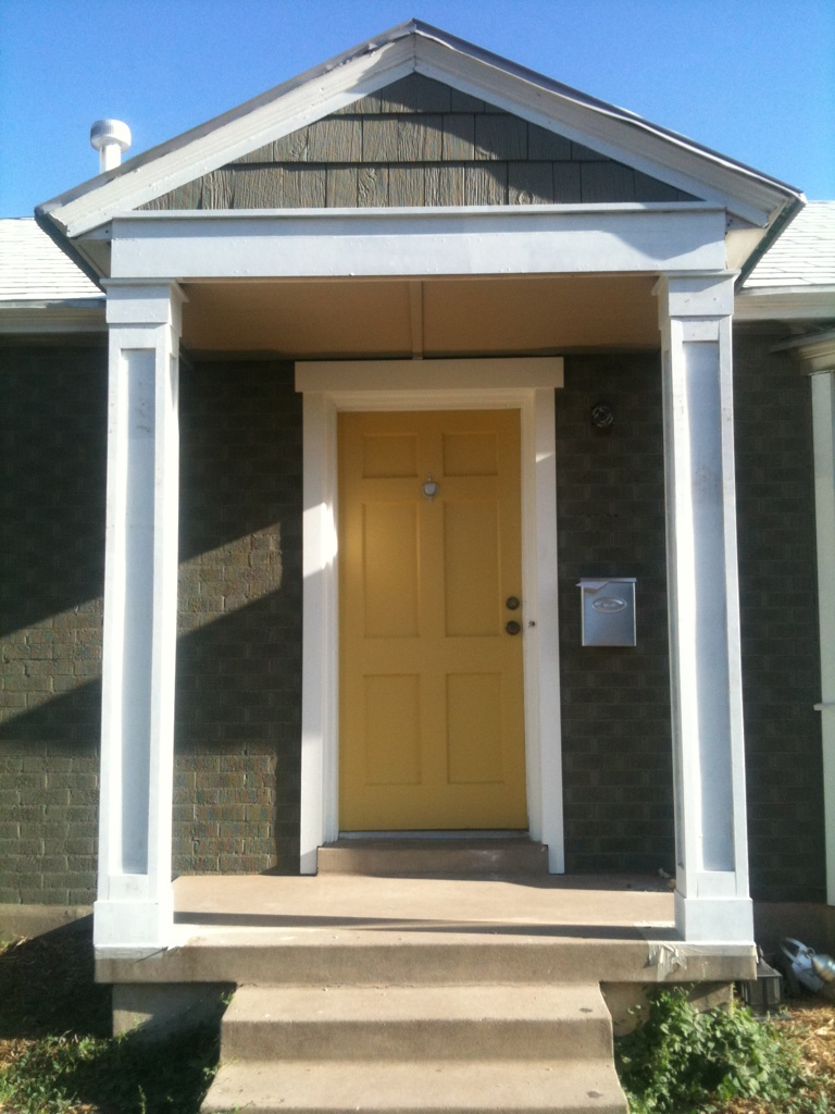
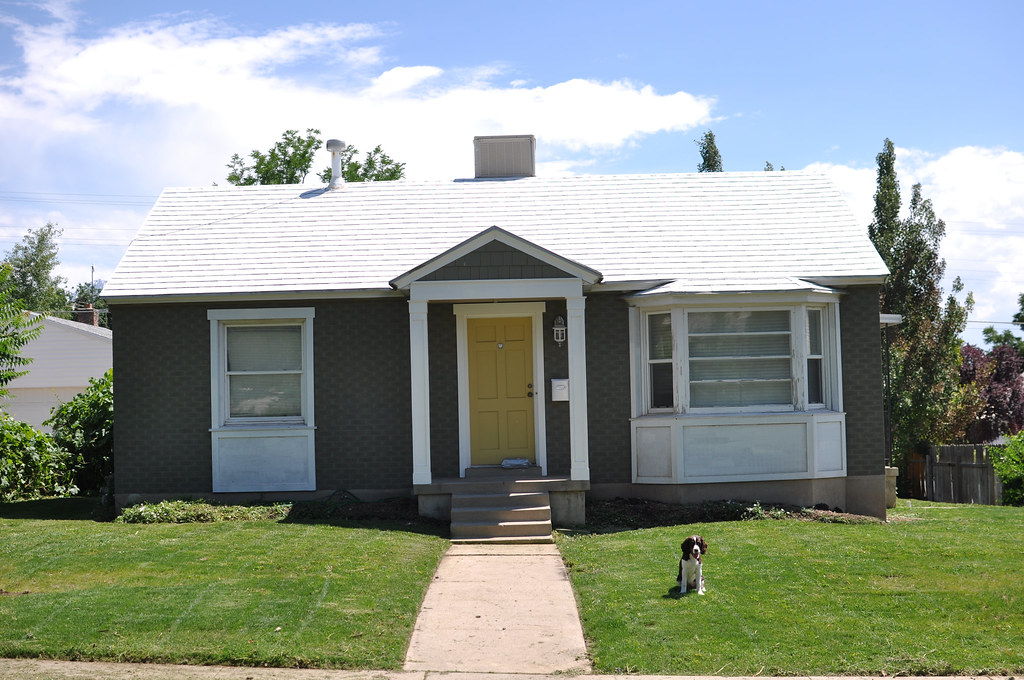
Along with the interior we have been working on the exterior. We removed the massive pine trees, ripped out the fence, added new trim and paint...
The yellow is a little more buttery in person... Less orange then the picture, it makes me happy!
Thanks for visiting! We love comments and followers...Any questions? I hope to be able to answer right away!
Thanks, Lindsay and Drew



All this time I didn't realize you were doing the work in the basement. What an adventurer!
ReplyDeleteHaha! Yep basemEnt dwelling. The upstairs is in a lot better shape then the basement was! But I dream of big sunny windows! Thanks for being a loyal follower!
ReplyDeleteIt's so fun to see the before and afters!! Great job you two!!!
ReplyDeleteThanks Katie! Its fun to look back. We kind of forgot how it all started.
ReplyDeleteWow! What a big project! Everything looks great.
ReplyDeleteThanks so much Ellie! It has been a huge project! Haha... Go big!
ReplyDeleteCongrats on DesignSponge! We'll see you on HGTV next!!
ReplyDeletewow!!! awesome job, i love your design aesthetic.
ReplyDeleteHi ~ just found your blog from Better After....it's in my favs now. LOVE your kitchen. Can't wait to catch up and read the rest of your blog :)
ReplyDeleteWow and wow. LOVE love the tile work in the shower, amazing!!
ReplyDeleteWow! Thank you thank you everyone for the wonderful comments! It truly makes all the hard work, and kitchen supplies and bathroom in the hallway worth it! More to come!
ReplyDeletelate to the party on this one but i LOVE the color of your entry door!! what color did you use?
ReplyDelete