
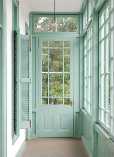
Today I'm focusing on accent color. Not to be confused with accent walls. I can appreciate accent walls as long as trim is involved. I will show you what I'm talking about below. More specifically accent colors on trim. The most common trim is either white or stained. I'm going to show some of my favorite accent trim. In the picture above my favorite part aside from the color, is the paint continues onto the trim below the window. I really like the panes on the door.
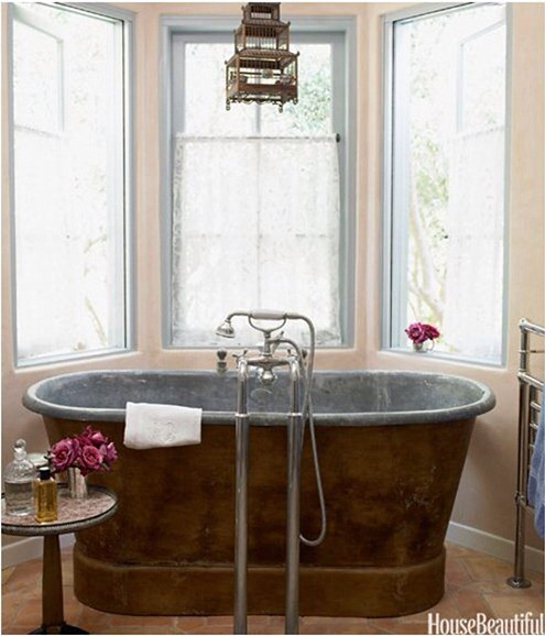
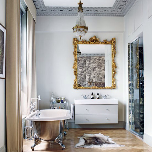
A subtle dash of color on the window casing, rail and stile. It's also interesting to me that they put the tub faucet in front if the tub instead of behind by the window.
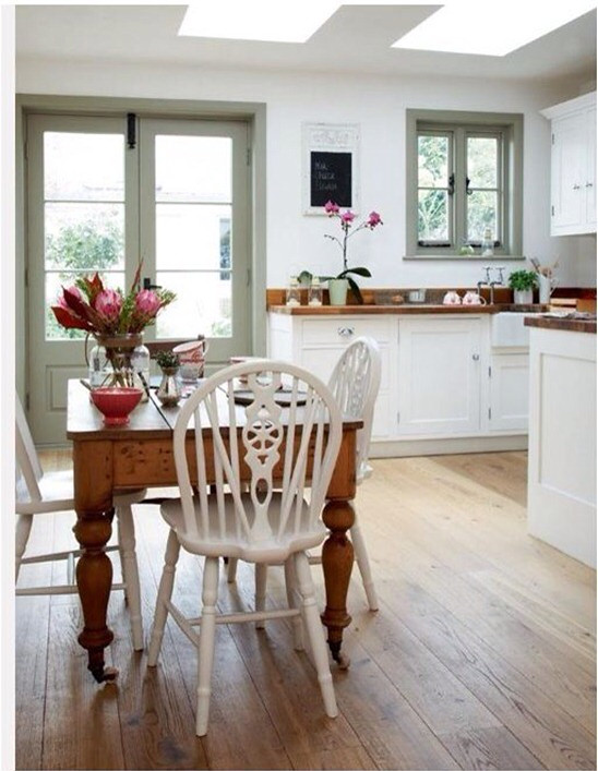
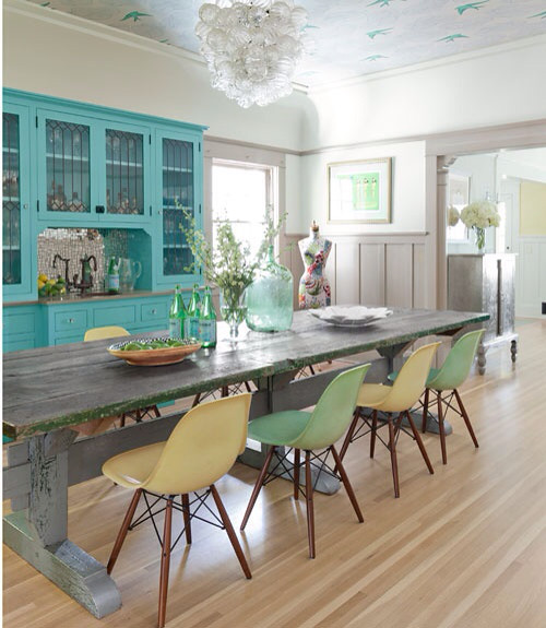
More accent paint in casing. The color is a perfect accent to the wood on the counter and table. They really compliment each other. I love the simplicity of the stool only finish on the window, no apron needed. It's a nice clean look.
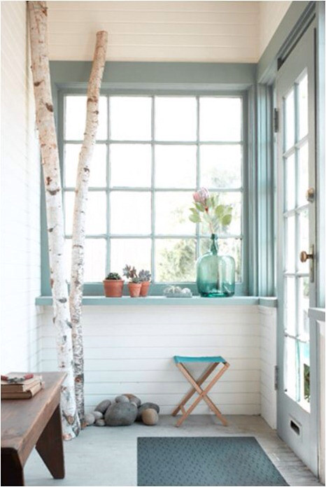
I would sit in the sunroom all day. I would for sure have my own aspen tree trunks as decor. I love this color.

The ceiling... Oh the ceiling! Don't forget your ceiling when adding color to your home. It's such an unexpected way to bring life into a room. We have loved our blue ceiling. It makes the room feel taller, gives it an extra dimension.
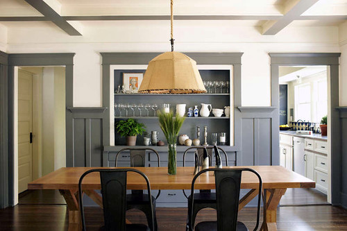
The grey on the bottom of these false beams makes your eye really stretch to see into the soffit. I am really taken by colored trim, it makes more sense to me to have the color on the bottom where little hands and dog noses are going to rub. And white above to make the room not feel top heavy.
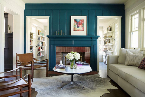
Here's the accent wall I was talking about. The tongue and groove highlighted by the perfect peacock blue. Not a color for the faint of heart.
I really like the look of mixing stain with paint. Some might feel like its like mixing metals and a no go... I say it's a do!
Again grey wainscot with light walls. What I don't love in this picture is the trim that wraps around from the headers. I think it shortens the room too much. Stops your eye before it can see the awesome wallpapered ceiling.
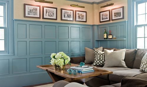
Blue paneling. I really like the shelf they built into the trim. Clever clever.
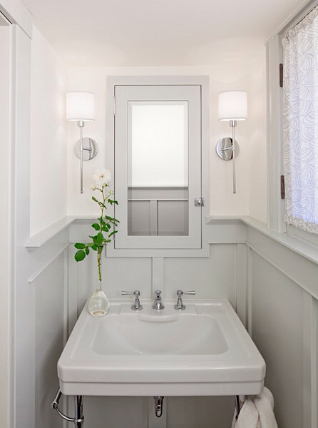
Trim built around the medicine cabinet. Gorgeous! I really like those sconces too!
All white except the ornate crown/tray ceiling.
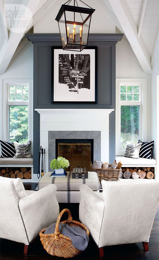
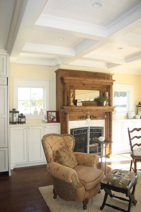
This mantle is one of the greats! The dark grey outer mantle. Yes please! It really centers the room. I love the steps the low set windows give. And the canvas chairs and ottoman. It's a perfect room.
Want help with trim? Send us an email. We would love to give you ideas on how to add character to your home.


No comments:
Post a Comment