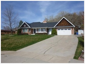
Ripped off the awful precast post and cheap guardrail....
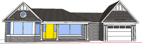
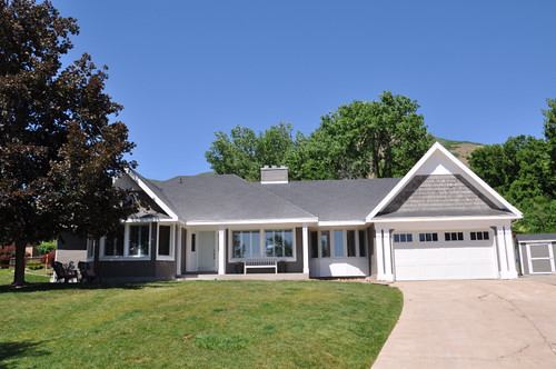
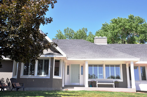
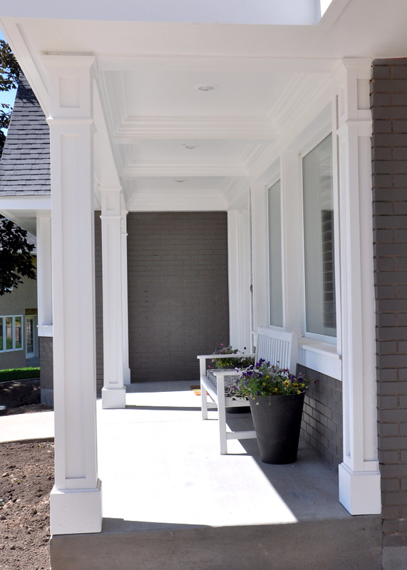
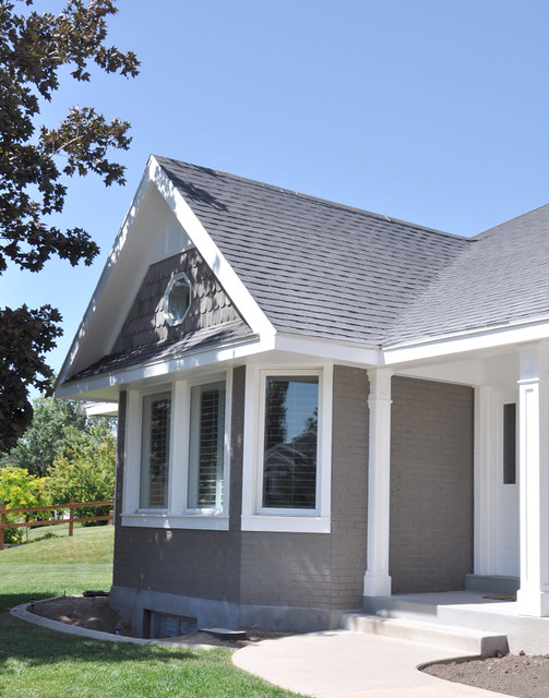
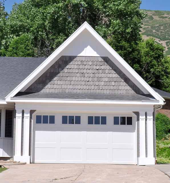
So this was my design.... I wanted to keep it true to the original style and accentuate the scalloped shake gable ends by adding some board and batten. Some shaker panel posts. With a little extra detail to fit closer with some ornate posts they have in the home. Add some posts and a large header to the garage to provide balance and strength to the structure. And wrap the windows with a simple stile and apron.
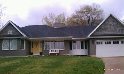
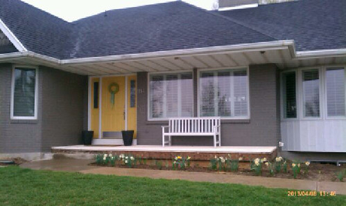
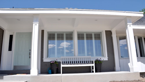
And here is the after...
I'm in love.... It was hard to drive away from it at the end of the day...
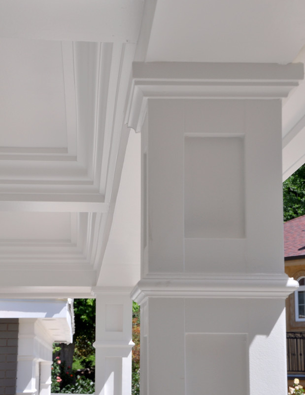
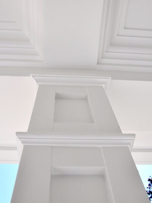
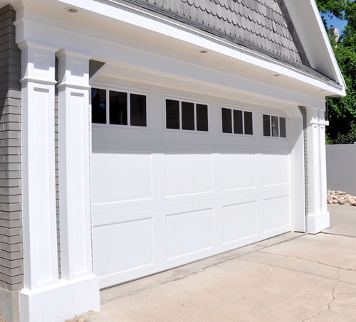
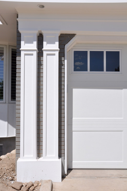
The posts we used a flat cap, cove mould, small shaker panel, pencil mould then a large shake ended with a cove mould and plinth block.
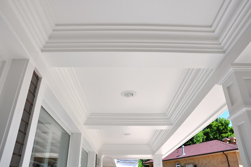
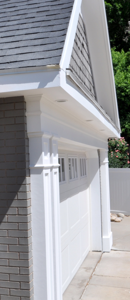
Oh that ceiling! That ceiling! I love!
You can't stop at a beautiful porch can you? So you see how we had to keep going. We trimmed out the windows to creat balance and added the board and batten to add some interest.
And they did.
Then we added the header to give the illusion of support. And that delicate pencil mould for more interest... Then double posts on either side. Love!
Especially in Utah the land of the overgrown, over pronounced, cheap garage it was so rewarding to design a garage with a lot of detail.
Double your pleasure...
If your house needs a facelift give us a call...
For your design build needs...
801.244.8790




A.MAZ.ING!!!!!! I don't think I can say it loud enough. You guys are truly a dream team!
ReplyDeleteoh my goodness- so so great the ceiling's my favorite
ReplyDeletewhat's the color on the door?
ReplyDeleteIt's benjamin Moore Palladian blue.
Deletefantastic and love all the attention to architectural details! This is a beautiful transformation! xo Nancy
ReplyDeleteThank you so much. We are very happy with how it turned out. And it's nice to be appreciated by people who know what they are talking about. I love and follow your blog!
Deletefantastic and love all the attention to architectural details! This is a beautiful transformation! xo Nancy
ReplyDelete